
Remember elementary school when you used to draw bar charts about M&Ms. One bar would represent the red ones - my favorite - another bar represents the blue ones and so on. In the end, you’d have a graphical representation of how many M&Ms of each color you had. Provided you didn’t eat part of the project.
Your camera does the same thing, only instead of counting the M&Ms, it counts the number of pixels that share the same tonal value. The resulting graph is called a histogram.
The histogram is a bar chart that graphically plots every tone that is used in your digital image. The horizontal axis indicates the brightness level or tone. The far left indicates black with no detail while the far right indicates a white with no detail. Shadows are on the left side while highlight areas are on the right. Mid-tones fall in the middle. The vertical axis indicates how many pixels exist for each specific brightness level. The taller the bar, the more pixels are present for that value.
The scale of the histogram depends upon the digital file it represents. For 8-bit files, the scale runs from 0 to 255. A 16-bit file has a scale from 0 to 65,535. This bit-depth of a file simply tells you how many different tones you can work with and that's a conversation we'll need to cover in a future blog post.
In either case, just know that the left side of the chart represents black with no detail while the far right side represents white with no detail. The middle represents middle tone - a value that is produced with an 18% gray card. This is regardless of the bit-depth of the file.
It’s important to learn how to read a histogram and understand what it is showing you. The most important thing to remember is that there is NO standard shape for any histogram. Images don’t need to look like bell curves or any other shape to be properly exposed.
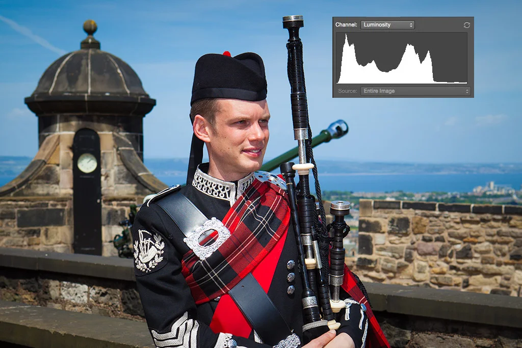
For example, let’s take a look at the histogram above. You can see that there are values close to the dark end of the histogram, but not touching the left "wall". The image is heavily weighted to mid-tone values with very little highlight information. The graph is not bell shaped and it's skewed to one side. What is important is that it represents the tonal values that are in the scene and it tells me that the image is exposed properly.
The portion of the graph that is close to - but not touching - the left side illustrates the dark tones in the image. His black uniform, the pipes and even the black door behind him are all included in this end of the histogram. By exposing the image so that these dark tone elements don't push up agains the side wall of the histogram, I've made sure to keep details in all these areas.