

The fundamental building block in photography is light. And as photographers we need to understand three basic elements of light: Brightness, Color and Direction. Together these elements define the quality of light on our subject. Today we want to explore just one of those elements and that is the Color of light.
Color photography was toyed with just a few short years after Joseph Niépce created the first permanent photograph in 1826 but it was Eastman Kodak that introduced the first modern color film in 1935. It wasn’t the first time the Kodachrome name was used but this new technology ushered in the three color process using three “additive” primaries of red, green and blue.
From that day forward, photographers have been honing their skills on color theory and design in an effort to produce the most stunning photographs. But color has proven to be an elusive topic to describe well. Just ask a group of people what the primary colors are. Some will say red, yellow and blue. Others will say red, green and blue, while others say cyan, magenta and yellow. The fact is, they are all right.

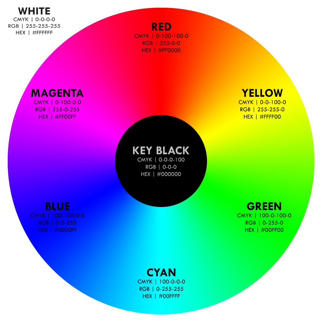
To define a model of primary colors you have to know something about the environment in which the model is used. It just so happens that with photography we are working in an environment of additive light. In other words, we are adding light together to made different colors. In this environment the primary colors are red, green and blue - commonly called RGB color.
It just so happens that the subtractive primary colors of cyan, magenta and yellow fit nicely into the RGB color wheel where you'll find that red is opposite cyan, green is opposite magenta and blue is opposite yellow. Don't get confused when you look at other sources and find color wheels that differer from this configuration. It simply means that those color models are most likely for subtractive colors - very common for artists who mix paints.
Color is an area of which many photographers don’t take full advantage. Great photographers study light, color and composition and find ways to use color to help tell their stories. Now there’s a lot we can do with color and the choices of colors we use in designing our images is called a color scheme. Let’s take a look at three common schemes.
Achromatic Images
Achromatic images lack color. More precisely they lack strong chromatic content. In the real world that generally means they lack color although images with some neutral colors can also be considered achromatic. The best example of this is a black and white image.
Also, remember that we don't always work in a world of absolutes. I've found many images in which I wanted to take a lot of the color out but leave a hint of the original colors behind. The image of the rifle and helmet could also be classifies as achromatic even though it isn’t made up of pure black, white and grayscale.
Complementary Colors
When you look at a color wheel, colors that are opposite each other are considered complementary. If you were to mix two complementary colors you’d end up with an achromatic mixture - no color at all. Compositionally we like complementary colors. They are very pleasing to the eye.
A great example of complementary colors are the images of the red rocks at Arches National Park against the blue sky. (above and below)
Monochromatic Images
Monochromatic colors are all the colors of a single hue. There can be quite a bit of tonal contrast but the single hue makes the images seem peaceful. The blue tone of the late sunset image reflects just such a mood.
Monochromatic Image
Understanding color helps you design images that are pleasing to the eye and engaging to the viewer. Proper use of color creates a sense of order and provides for a balanced visual experience. Take time to understand how you can get color to work for you.