
Composition is one of the four pillars of great photography and Color Harmony is one of the key elements of composition. Color Harmony is a theory about the combination of colors in a way that is harmonious to the viewer.
Rikard, of Zeven Designs, opined that color harmony is the reason the Hulk wears purple pants. It’s also the reason the original X-men had yellow and blue uniforms. I’m sure he’s right - the combination of those colors are harmonious to our eyes.
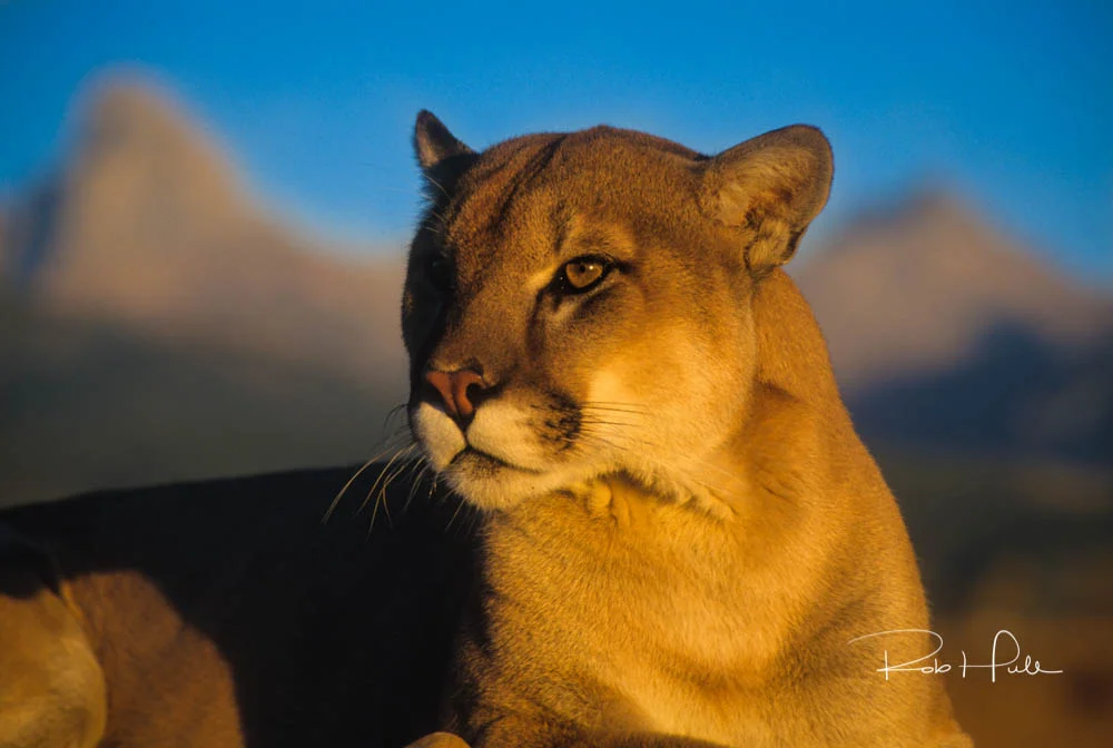
By waiting until the late afternoon sun created a nice warm glow, I was able to photograph this majestic cat against a blue sky. The sky blue and the warm fur color are complementary, creating beautiful color harmony. Just imagine if the sky was cloudy and I didn't have the blue in the image.
Graphic artists and painters seem to be more aware of color harmony than photographers. Maybe it’s because when they reach over to dab their brush on their palette, they make a concise decision about the colors they use. But photographers have a powerful tool in color that can be used to help them convey their story. By using the right color scheme, you can create an ambiance of elegance or tranquility. You can instill energy and youthfulness into your images. Color is a powerful tool but you have to learn how to use it effectively.

Boogie Man - I gelled the light for the background smoke using a blue gel that would be complementary the skin tone. This create a harmonious image.
Color Harmonies are usually grouped into different Color Schemes, each defining a unique relationship between colors on the color wheel. Today we’ll look at one of these color schemes, Complementary Colors.
But, before we do that, let me mention that you may find different color wheels. The color wheel used by most photographers defines Red, Green, and Blue as the primary colors. This is considered an “additive color model”. An older, more traditional model, is the Red, Yellow, Blue, color wheel. It is considered a “subtractive color model”. Don’t get hung up on which one to use. The concepts translate to both models. For our discussion, I use the additive color model with Red, Green, and blue primaries.

Opposite colors on the color wheel are complementary.
Complementary colors are opposite each other on a color wheel. Being opposites, they are considered to have a strong color contrast. For example, the opposite of the primary color Blue is Yellow. The opposite of the primary Red is Cyan.
More specifically, if two complementary colors are combined, they create a neutral color. Neutrals are black, white and any tone along the gray scale between white and black.
So, why do we care? Simple. We want to create better images. If you shoot portraits, having a good understanding of color harmony is an incredibly powerful tool in your quiver. Many photographers are happy that Uncle Louie doesn’t show up in plaid pants and a Hawaiian shirt. But great portrait photographers have helped their subjects with the selection of clothing and location that results in a beautifully harmonious image.
Learn More
Just Google “Color Harmony” and you’ll find a lot of great resources for more information. But, here’s a few of my favorite sources.