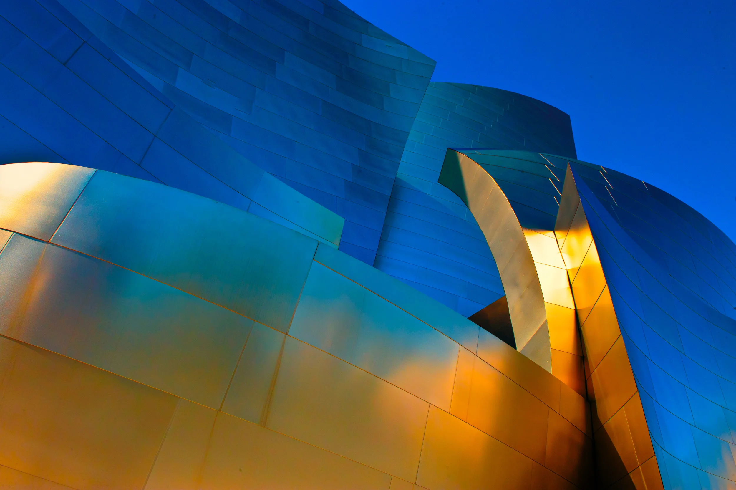
In the world of professional portrait photography there have always been discussions about ratios. The highlight to shadow ratio that often defines the look of dimension, shape, form, and even texture in a photograph. Everyone I know has been involved in these discussions and they generally end up with agreeing that a 3:1 ratio a good choice for a traditional portrait. This is a generally accepted standard but certainly not a rule to be followed. However, in this post I want to discuss the other areas of contrast that are not often referred to.
Color Contrast is also best used when it is in keeping with a mood or feeling you wish to convey photographically.
Scene Contrast
Subject Contrast
Light Contrast
Soft Scene Contrast coupled with great color is a winning combination and yet not a typical contrast scene you might normally think of.
Understanding that as photographers we are basically contrast controllers will help us to make the kinds of pictures that just might set us apart from the rest of the pack.
SCENE CONTRAST
As the digital transition is becoming complete, we’ve all been faced with issues of clipped highlights and/or blocked shadows. It is often the limitations of technology that causes the problem. However, it can just as easily be the contrast present in the scene we are attempting to photograph. For example, the human eye can detect approximately 20 to 21 different stops of light visually. Modern digital cameras can detect 8, 10 even 12 stops of light. However, the problem that arises is that the photographic papers we all work with only hold detail in highlights and shadows in about 4 or 5 stops of light.
As a result we have to go into each session knowing where the brightest highlight will fall as well as the darkest shadow. By making sure this scene contrast is no more than 4 to 5 stops apart will insure our having a full range image that will print beautifully with detail throughout.
SUBJECT CONTRAST
Elementary students learn early on in art classes that in order to draw a proper balloon, you draw a circle, maybe add a string, and then draw a highlight on one side (usually in white) and draw a shadow on the other side (in black or another dark color). This defines the balloon as having depth and looking realistic. If we take that as an example, let’s consider the tonality of our subjects.
The entire subject in this image of my mantle above the fireplace is an example of Subject Contrast resulting in a successful image.
In portrait photography we have been taught about the light patterns on a face. These patterns are terrific to know and understand but they only tell half of a story. The patterns: Rembrandt (or modified loop), Loop, Butterfly (or Paramount) and Split are all descriptive of the shadow on the cheek or lip created from the direction of light as it crosses the subject’s nose. Great to know. Very helpful in determining true shape form and texture on a light face. However, when photographing someone with very dark skin we must understand that the rules change. We must then work in the range of light areas, not dark areas, in order to produce the contrast necessary to give us, and our viewer’s usable information about the subject. Think about it this way. If I am asked to photograph a set of billiard balls, the cue ball will be defined by the shadow to create depth, shape and form. However, the 8-ball will be identified entirely by the highlights that might appear. Obviously, the contrast we place on a specific subject s directly related to the tonality of the subject and as working professionals, we need to understand the basic concept.
LIGHT CONTRAST
The size of a given light source is always relative to its distance to the subject. And on this topic I can go on for hours and in a future article probably will. However, you can always change the contrast of any given source slightly by simply changing the light from raw and sharp to soft and diffused. Light contrast is another control that we can keep in mind in our mental tool box as we approach a session. A friend of mine is a big fan of small incandescent lights added to a bride outdoors late in the day. Another way to control that is to diffuse it slightly. You’ll see a slight loss of light in terms of image quantity. But the benefit for the bride’s face in terms of image quality will really enhance your efforts and make you a hero.
Soft yet directional Light Contrast helps to make this one of my favorites.
I tend to speak about control a lot in my workshops. And by simply keeping these few techniques in mind we at least have a few more tools in our arsenal of things we can pull out on a shoot. And being in control is what it is all about...

