by Tony Corbell: As we bump into photographers of all types all over the country, in fact, all over the world, the discussion always makes its way around to light and lighting. Everyone wants to discuss the latest and greatest in lighting. The lighting tools as well as the brand names. Well, for years this is what I have been known for, so it seems reasonable. Articles, books, videos, workshops, they have all been about light for me for a lot of years. But this is really only one half of the picture.
SHADOWS... There! I said it. There simply is not much emphasis out there on that crazy ol' shadow these days. Probably because light is more fun to talk about and more easily identified as a primary controller of the mood and style of a photograph. But the shadow is the exact and opposite reaction to the light. So, it might make sense to at least add it to the discussion.
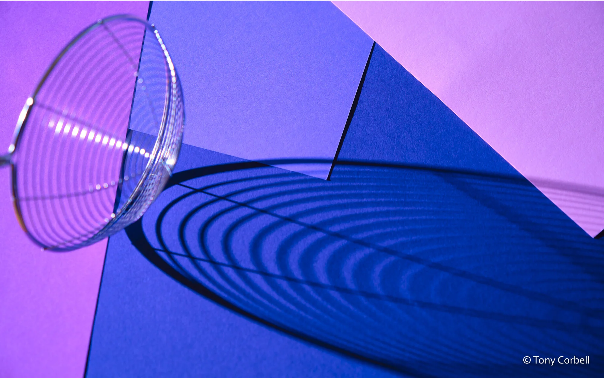
“The Strainer”
For me, the shadow discussion stopped in my first year of being involved in photography in a small portrait studio in West Texas. We lived and died by the four light patterns on a face. Of course, they were simply the direct result of the lighting and the light patterns we were taught. Rembrandt, Loop, Split, Butterfly (AKA Paramount) were all great and important lighting patterns we needed to learn and frankly most portrait folks still use these every day on every portrait subject. Just keep in mind that they are all descriptors of the shadows from the nose projected onto the cheek or lip. And while the shadow is very important, in fact critical for studying light patterns, shadows are not ever followed up on. Ever. So, let's talk about it. Depth, shape, form, dimension, contrast, strength, can all be determined visually by how the shadow is created.
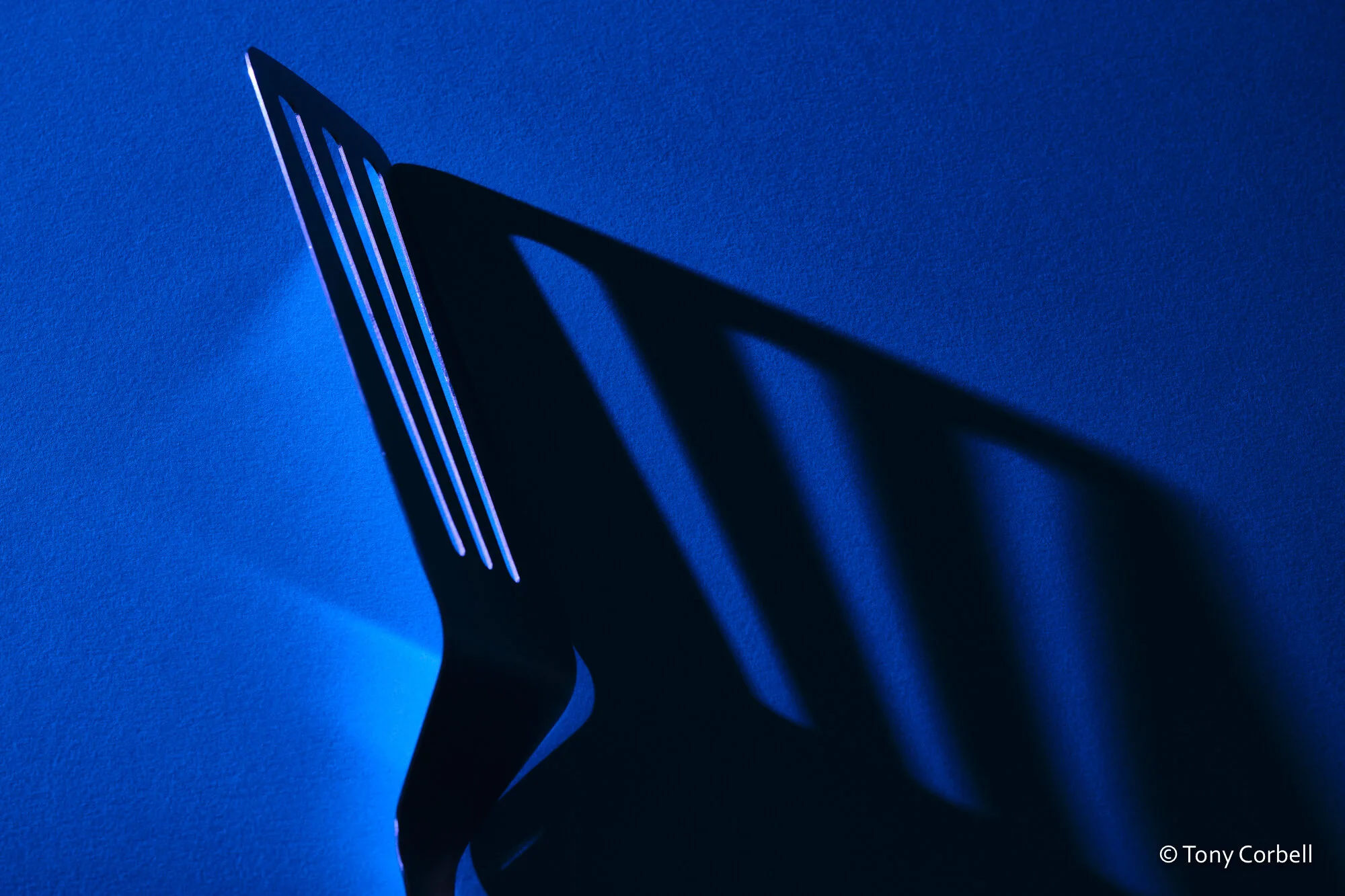
“The Spatula”
Is it sharp and cutting? A small light source is the direct cause of this look. If you want the shadow to be a bit softer, increasing the size of the light source does it for you. The optical rule is that the larger the light source, the softer the edge of the shadow. The shadows can be on the product or subject itself as well as in the surrounding or background area.
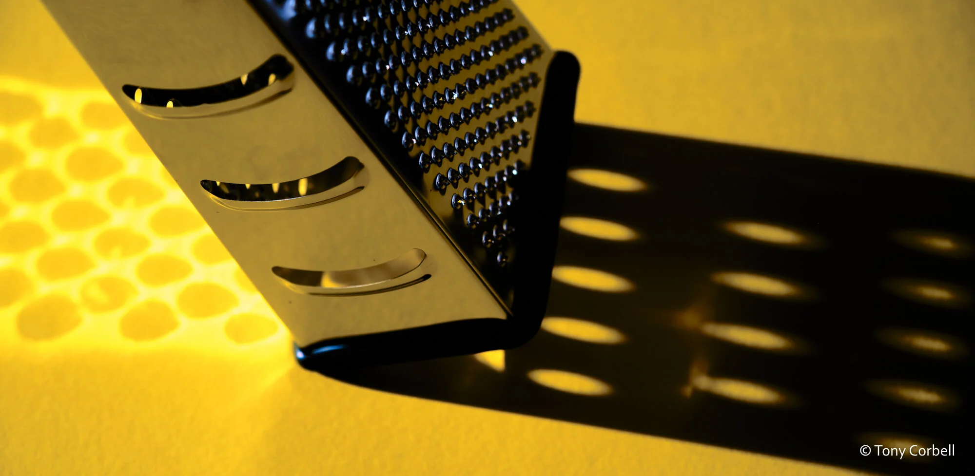
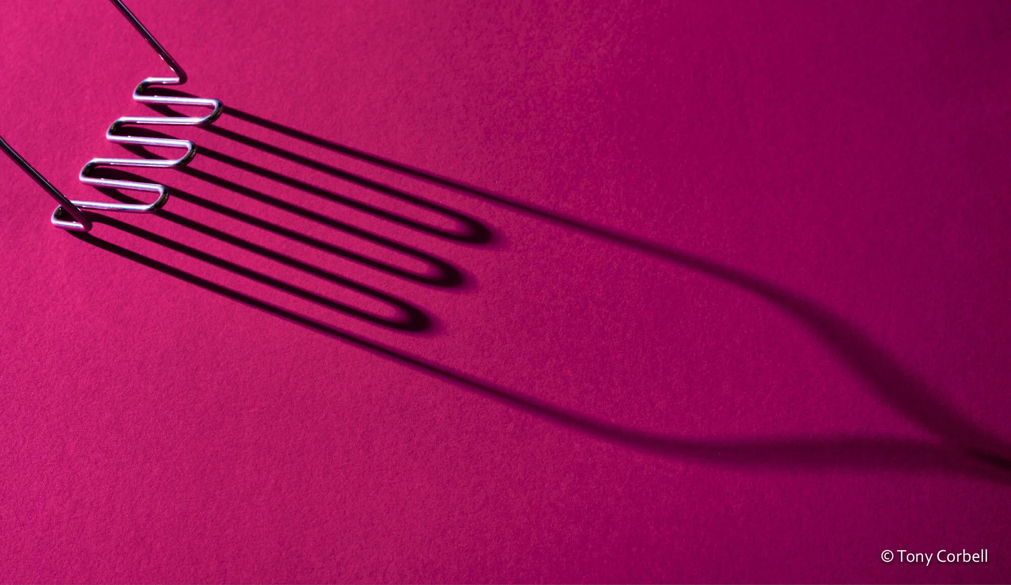
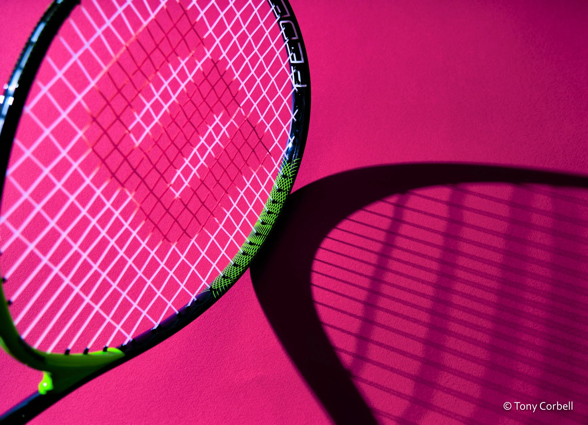
Here is a series of recent pictures I did that I call "Kitchen Aids," a fun and free spirit sort of project I have been working on for wall art for a variety of stock image markets. While the color and the day to day subjects are fun to see, it's the shadows that draw the viewer in and give them the attention visually.
“The Cheese Grater”
What can you next create with great, well-placed shadows?
“The Potato Masher”
“What a Racquet”


