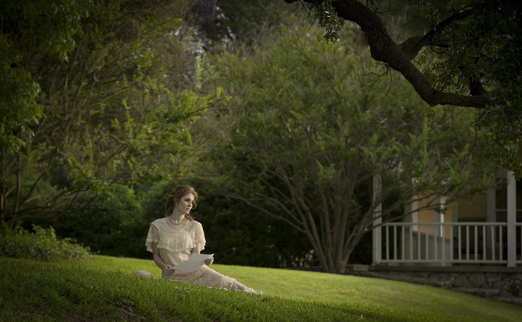
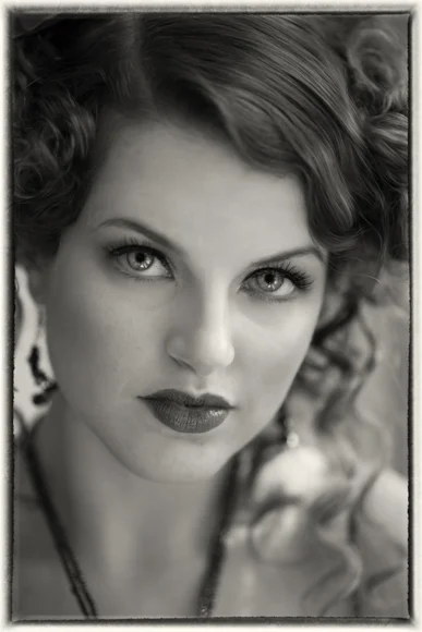
The first workshop for Tony Corbell Photographic Workshops is a sold out success. Making a Merit showed the process for creating a planned story-telling image from concept to print. Everyone had a great time and the results are stunning.
Creative Exposure
We’re happy to report that we are back from our Greek Islands Photography Tour and it was a smashing success. Many people have worried about the financial and political situation in Greece but we found everything business as usual. The Greek people are wonderful and everyone had a great time.
More about the trip later. Today we want to share with you some photography tips that will really add a lot to your portfolio. Since the advent of digital photography the use of filters has been greatly reduced. Color correction is now a menu option and special effects are now done digitally. One of the few filters that is still recommended is a good polarizing filter. But there’s another one you’ll want to add to your camera bag - a good Neutral Density (ND) filter. We packed some Vu filters for our trip to Greece and the results are stunning.
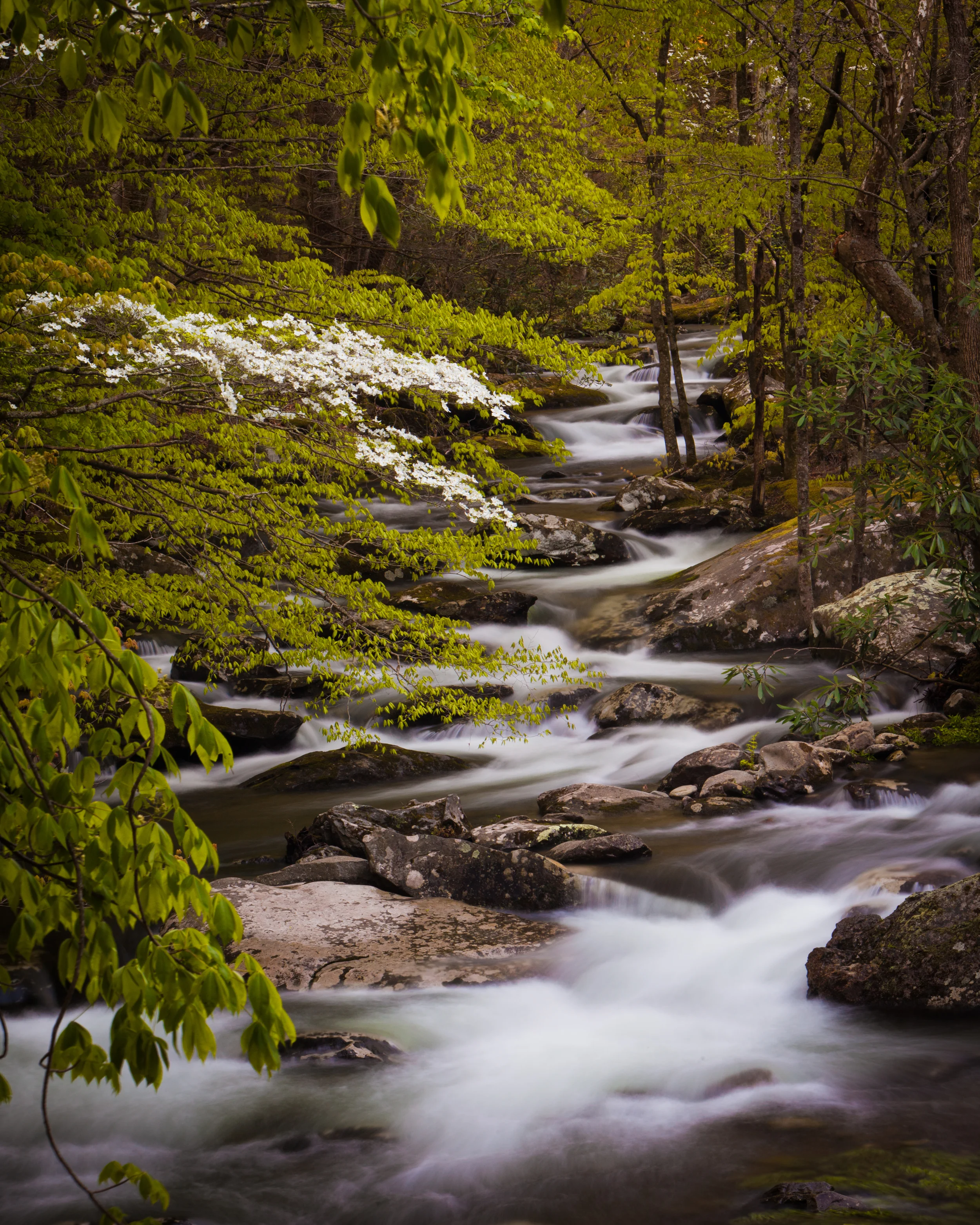
This was shot at ISO 100, f/22, 20 seconds with a 10-stop Neutral Density filter
Neutral Density filters reduce the amount of light that passes through the lens without altering the color of the light. This provides the photographer a broad range of flexibility in managing their exposure and depth of field. You can find these filters in a variety of densities. I use VU filters and they provide ND filters in 1, 2, 3 and 10-stop densities as well as a Variable Neutral Density filter that provides up to 7-stops of density.
So, why do you want to use one?
When you compose an image, one of the “photographic controls” you can use is shutter speed. As you know the shutter speed can be uses to show movement - either freezing movement or blurring movement. I love waterfalls shot with long exposures that turn the water into a milky smooth blur.
Without a filter you’re limited on when you can do this. In bright daylight, if your camera’s slowest ISO is 100, then even at f/22 you’ll be getting a shutter speed too fast to blur the motion. Some people add a polarizing filter which gives you 2 stops of density, allowing you to reduce the shutter speed even more. But in bright daylight that is still too fast to really blur the water.
This is when you mount your 10-stop Neutral Density filter. If your shutter speed without the filter is 1/60th of a second, after you mount the 10-stop ND filter you get a 15 second exposure. Now that will blur the water.
You can read more about the Vu filters used on their website at VuFilters.com.
Lay Out and Print a Greeting Card
8-bit vs. 16-bits: What's The Big Deal?
Combine Catalogs in Adobe Lightroom
Between Light and Shadow with Tony Corbell
Light Control with the Beauty Dish and the Octabank
“No matter what you use as a light shaping tool, care must be taken to show the true features of the subject”
As more and more working photographers gain high levels of skill in their chosen craft, I feel there might be a need for a new way of thinking in terms of photographic education. Perhaps it could be looked upon as a new way to learn for those who are already knowledgeable. With that in mind welcome to Between Light and Shadow. In this series we will explore not only the “how” a particular technique might be or could be used, but more importantly “why.”
For many years photographers have been given a plan to follow by well-meaning mentors, a graphic diagram to copy from a periodical or website, or a recipe with a specific technique to employ in their work. However, the direction of this series is dedicated to teaching the theories and why’s of light and shadow control to better understand the use of our tools, the reason for their existence, and when to choose one tool over the next, as opposed to a recipe book style of education.
To begin this new concept we will look at two particular lighting tools to discuss and illustrate. Today we are seeing an increase in people using the popular beauty dish as a main light source. It is smallish, lightweight and not terribly expensive. We are also seeing quite a large increase in people working with the octabank. I wanted to create a comparison and see if we can determine the specific use of each and under which conditions we would choose one over the other.
Our first sample image was taken with an octabank that was approximately 48”in size and in both of the example pictures placement was about the same as the width of the octabank, 40”-48”. One of the things I have tested out and proven true over and over is that with any large light source it is generally a better picture when you work the source very close to your subject. However, care must be taken to show the features of the subject. There are times when an extra large light source becomes “mushy”, such as a really tight head shot with a 4’X6’ softbox very close to the face. Often this can become a little softer than is comfortable to the eye and can actually alter facial features by eliminating any example of depth, shape and true form with little or no shadows and very soft highlights.
Great Light Sources Equal Great Catch Lights in the Eyes
One of the important elements to keep in mind in portrait photography is that often the highlight in the eye, the catchlight, becomes a design element. The octabank does a great job of creating a good, substantial catchlight that when placed just about anyplace in the upper portion of the eye yields a great looking picture with life in the eyes of your subject.
The beauty dish, on the other hand, has its own sense of style and a look that when used appropriately will turn an average picture into something very special. But it is not the forgiving, soft light source you will find with a softbox, octabank or even a raw light behind a translucent diffusion panel. It is best used when close to the face and, as it is fairly directional, the exact placement is critical. For me, with close placement of the light in its distance to the subject, I move the source up and down while looking carefully at the face and literally watch for the perfect “sweet spot” which reveals itself a little differently with each subject. But trust me, when you see it, you’ll know it.
While so many light-shaping tools use diffusion fabric with light transmitting through the fabric softening the light quality, the beauty dish works by bouncing the light into the parabolic shape of the silver or white dish, reflecting the light outwards onto the subject. This gives an entirely different feel to the skin, especially in a subject that has great skin and great features to begin with. When in the butterfly or “paramount” position, high and above the lens, the cheekbones are greatly enhanced by introducing slight shadows just under the cheeks and the mask of the face is ideally lit to give great definition.
As an added feature, both of these examples of working with the beauty dish also have a grid in place on the light-shaping tool. The grid helps to prevent light from spilling into areas that you might not intend to light. For example, if it is important to not allow light to strike the background, a grid spot for the beauty dish is ideally suited for this task as it contains the light and directs it only straight-forward, not outward away from the source.
To recap, the beauty dish is really good for especially smooth skin and clean, even facial features of the subject. Think of the beauty light as being great with beautiful faces. While the octabank is really good at smoothing out imperfections in the face and skin such as blemishes, wrinkles, etc. and does a great job softening these features on your subject.
Tony Corbell, Photographic Craftsman and Approved Photographic Instructor is a long-time PPA member, photographer/educator and recipient of the 2014 Gerhard Bakker Award and has conducted more than 650 seminars/workshops throughout the world. Send any ideas for future articles to: tony@tonycorbell.com
Shooting Rivers and Waterfalls
Reading a Historgram
Remember elementary school when you used to draw bar charts about M&Ms. One bar would represent the red ones - my favorite - another bar represents the blue ones and so on. In the end, you’d have a graphical representation of how many M&Ms of each color you had. Provided you didn’t eat part of the project.
Your camera does the same thing, only instead of counting the M&Ms, it counts the number of pixels that share the same tonal value. The resulting graph is called a histogram.
The histogram is a bar chart that graphically plots every tone that is used in your digital image. The horizontal axis indicates the brightness level or tone. The far left indicates black with no detail while the far right indicates a white with no detail. Shadows are on the left side while highlight areas are on the right. Mid-tones fall in the middle. The vertical axis indicates how many pixels exist for each specific brightness level. The taller the bar, the more pixels are present for that value.
The scale of the histogram depends upon the digital file it represents. For 8-bit files, the scale runs from 0 to 255. A 16-bit file has a scale from 0 to 65,535. This bit-depth of a file simply tells you how many different tones you can work with and that's a conversation we'll need to cover in a future blog post.
In either case, just know that the left side of the chart represents black with no detail while the far right side represents white with no detail. The middle represents middle tone - a value that is produced with an 18% gray card. This is regardless of the bit-depth of the file.
It’s important to learn how to read a histogram and understand what it is showing you. The most important thing to remember is that there is NO standard shape for any histogram. Images don’t need to look like bell curves or any other shape to be properly exposed.
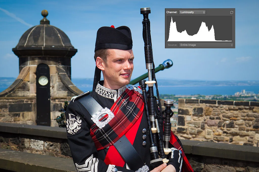
For example, let’s take a look at the histogram above. You can see that there are values close to the dark end of the histogram, but not touching the left "wall". The image is heavily weighted to mid-tone values with very little highlight information. The graph is not bell shaped and it's skewed to one side. What is important is that it represents the tonal values that are in the scene and it tells me that the image is exposed properly.
The portion of the graph that is close to - but not touching - the left side illustrates the dark tones in the image. His black uniform, the pipes and even the black door behind him are all included in this end of the histogram. By exposing the image so that these dark tone elements don't push up agains the side wall of the histogram, I've made sure to keep details in all these areas.

